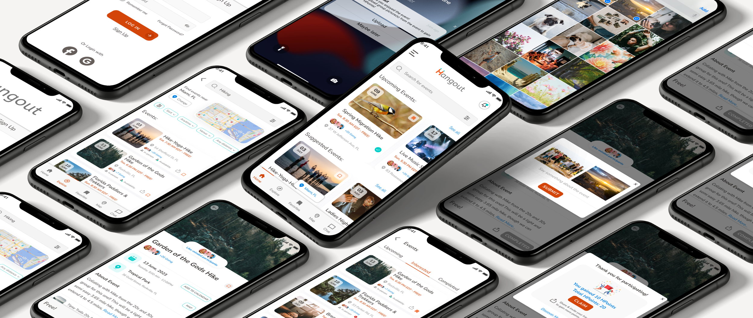
Helps people find the right events and meet new people

Role
Solo UX/UI Designer & Researcher
Tools
Figma, Pen, Paper, Miro, Zoom
Timeline
30 days
Overview
A start-up company has launched a new product that aims to make it easier for people to meet new friends. The product aims to create a social user experience that will help users find meet-ups and events near them, as well as participate in activities with other people.
Problem
The business team has noticed that the number of people who say they will attend an event is significantly higher than the actual number of attendees.
According to data from the company, 20% of people who say they will attend an event actually do.
Solution
Many people forget about events booked, get anxious about meeting new people, or aren't interested in attending.
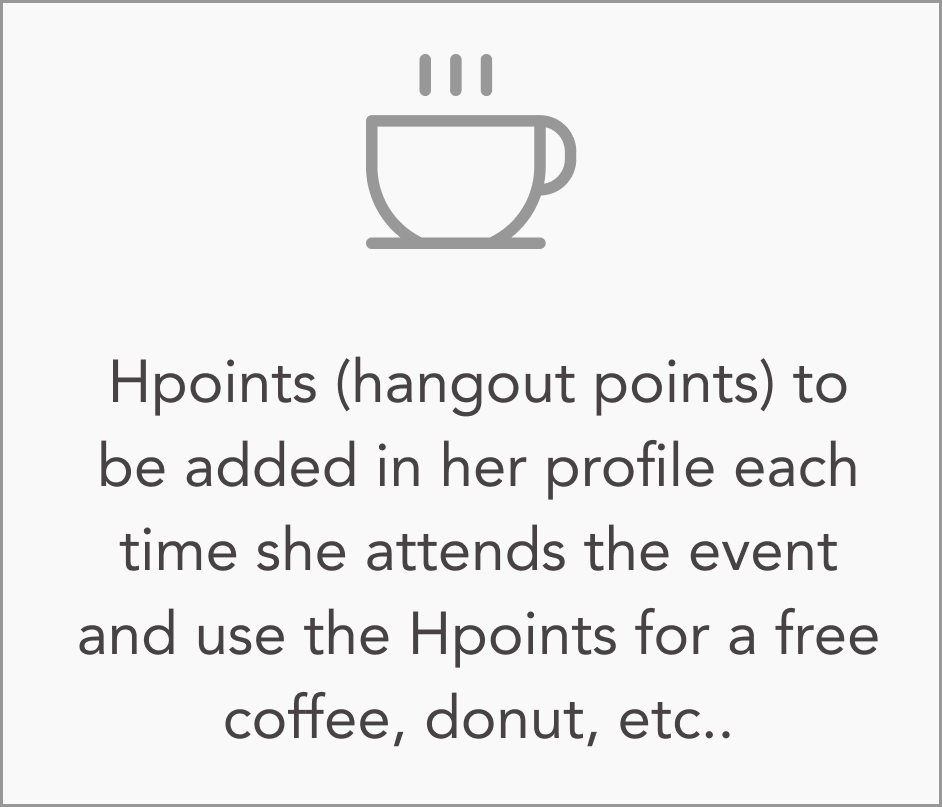
Reminding the user of the event a few days before, matching them with like-minded people, and providing incentives will help them out
Final designs
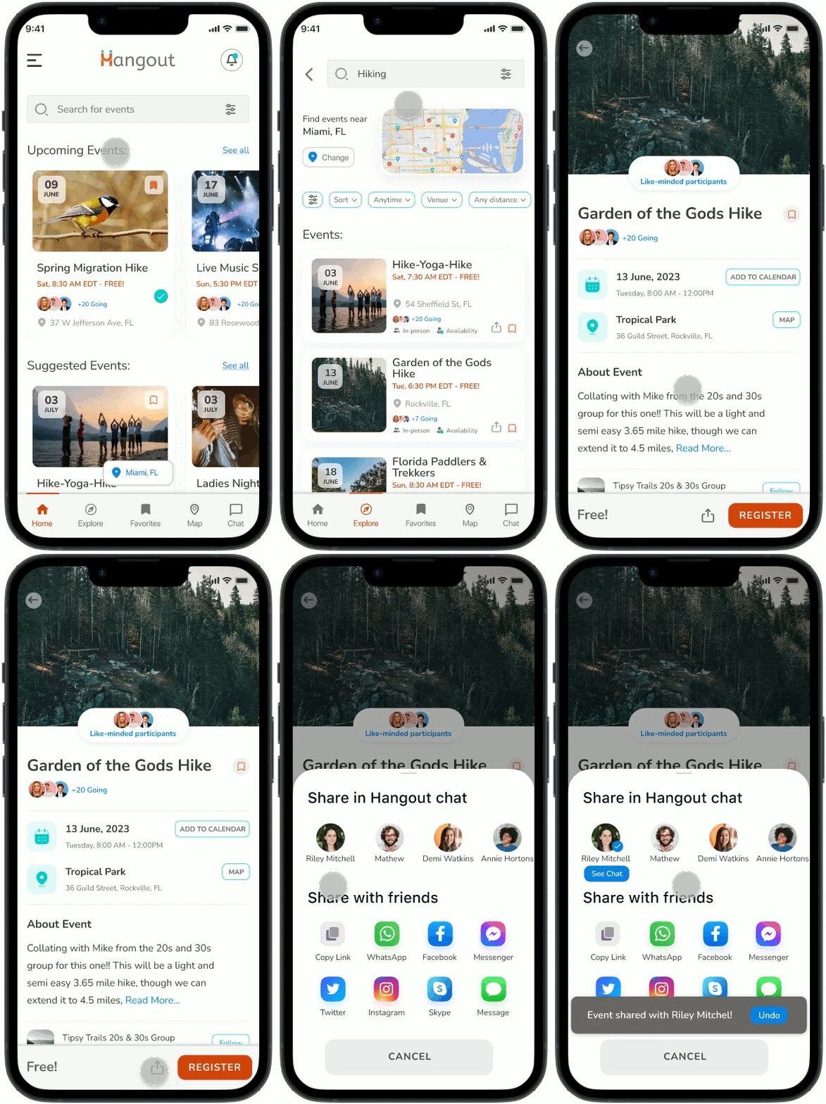
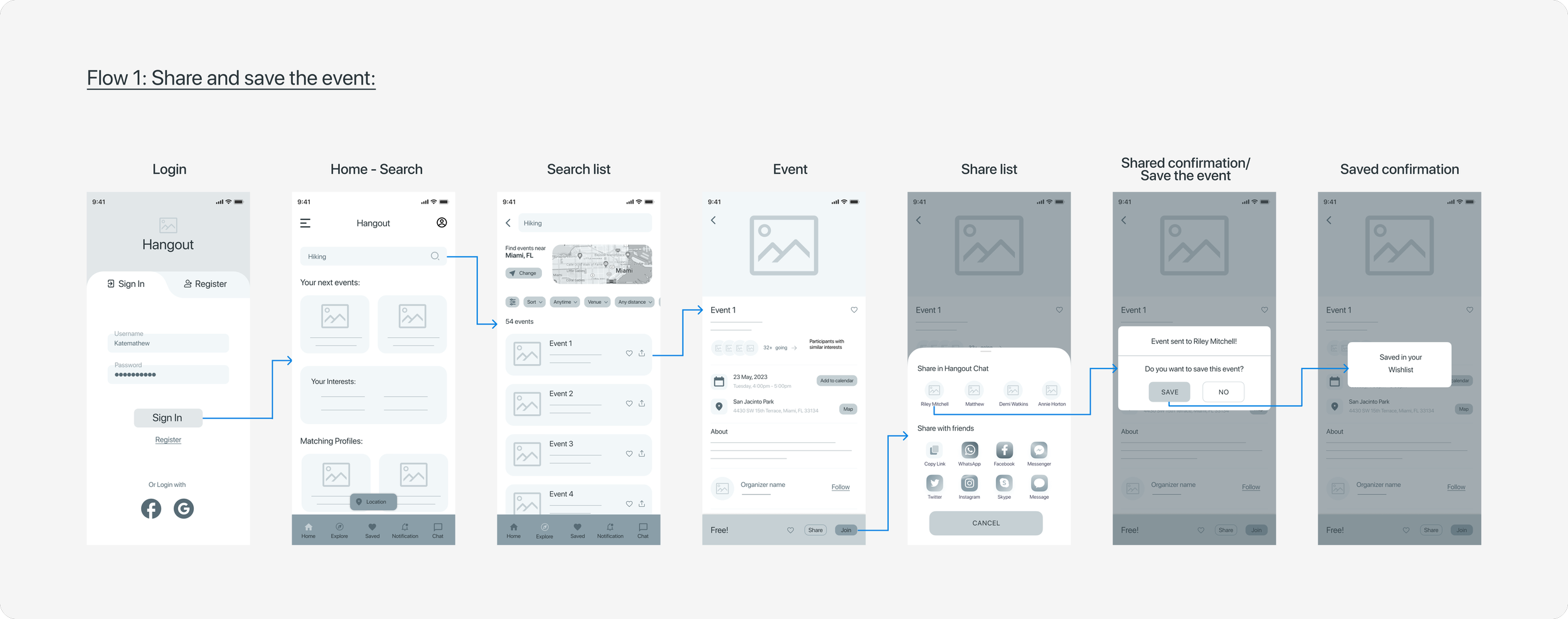
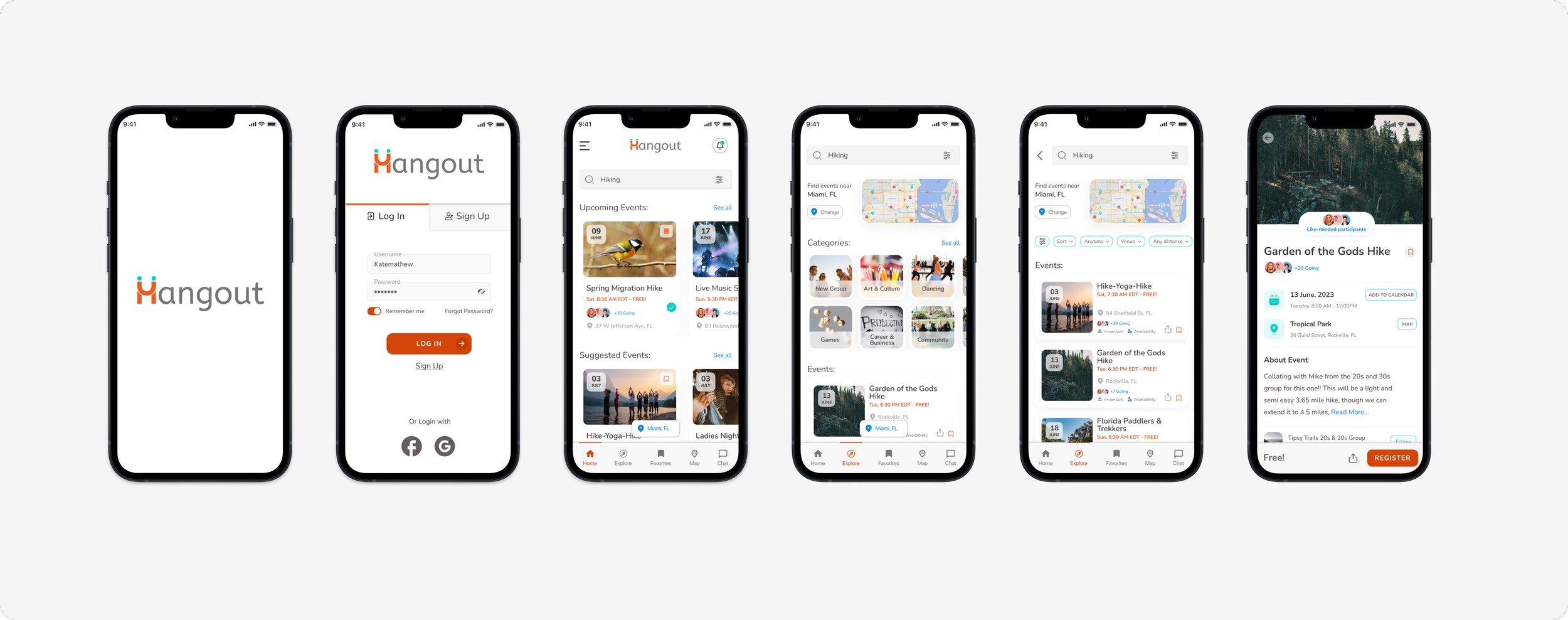
Discover the event, and share it with friends.
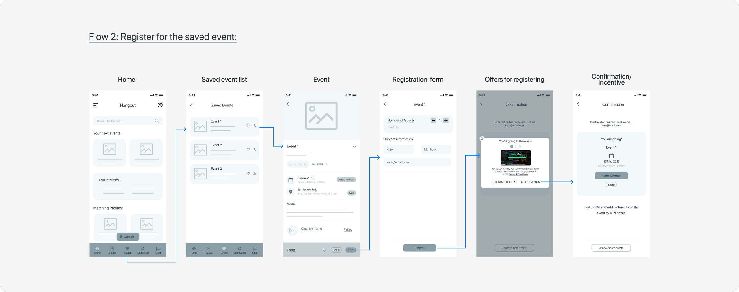
Complete your event registration directly from your saved favorites list.
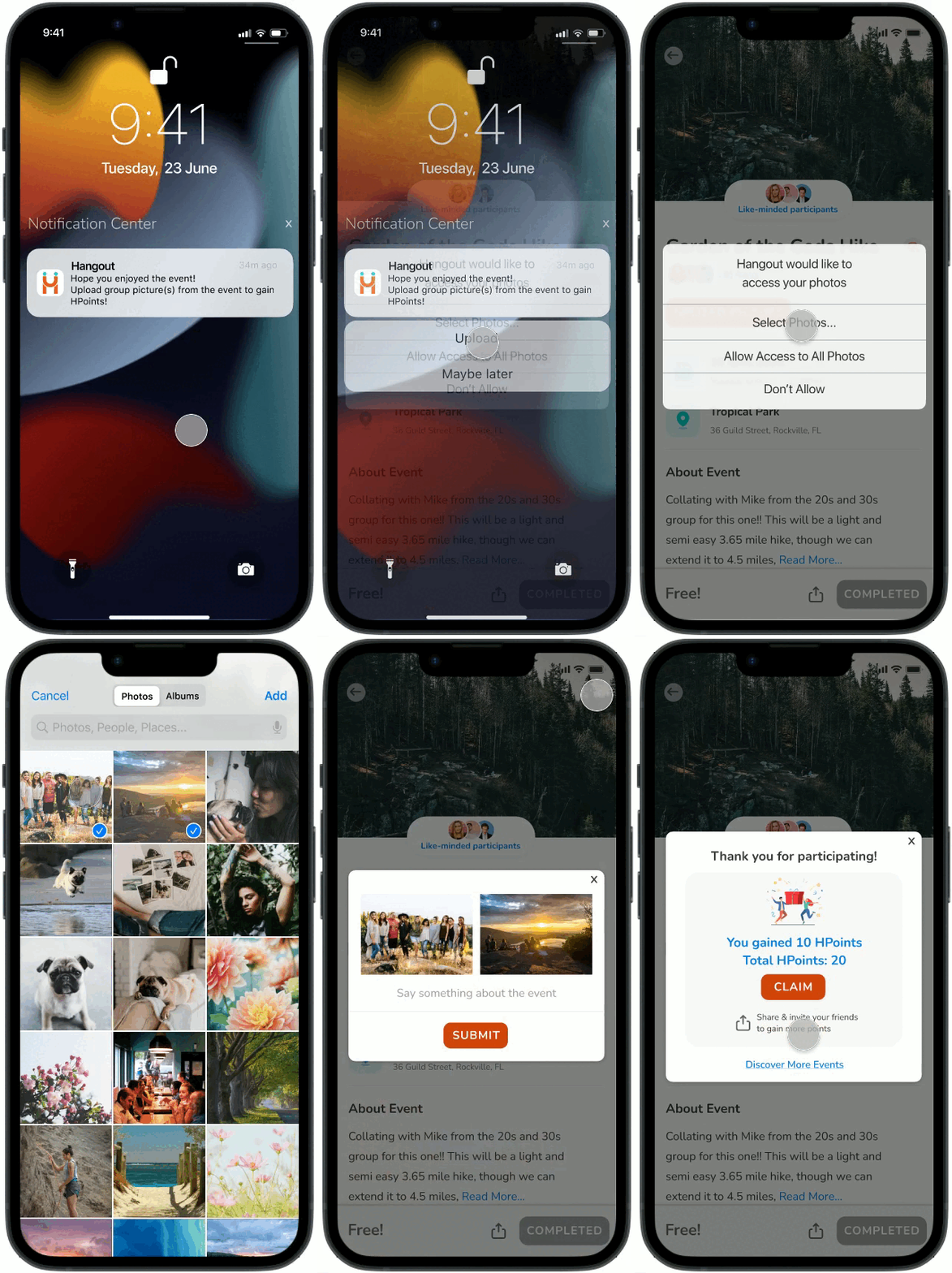
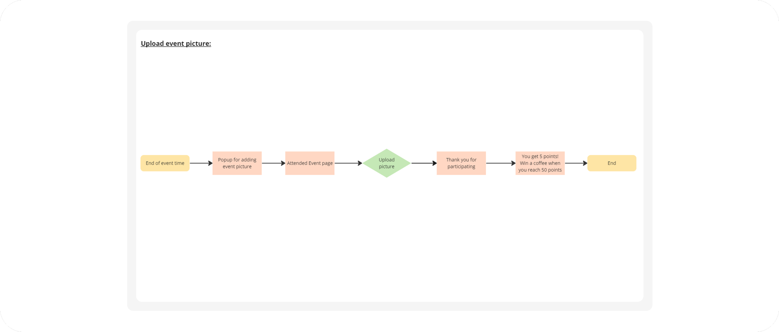
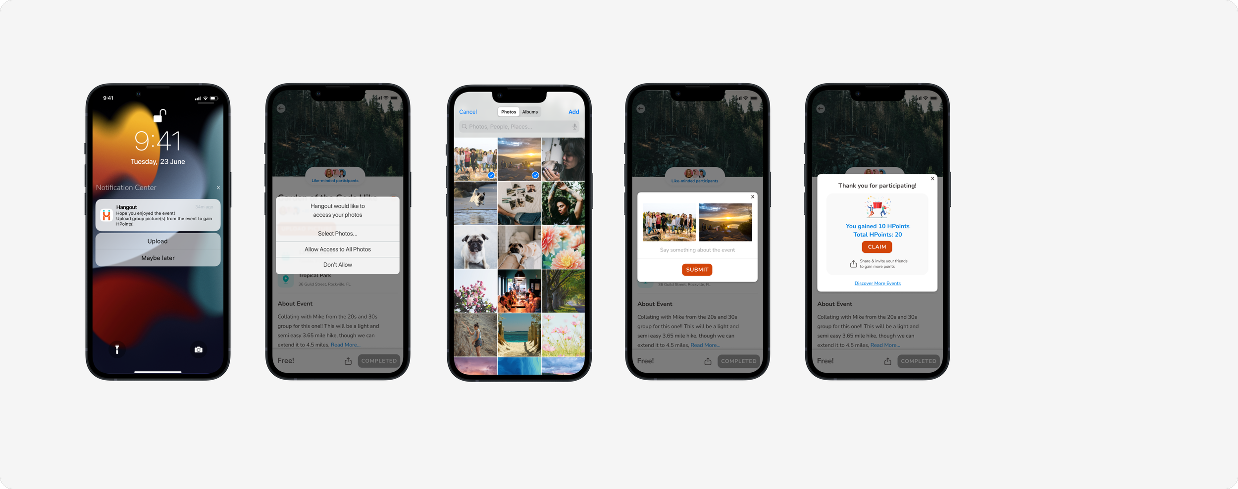
After participating in the event, upload picture(s) to receive the incentive.
How did I get to the final design?
Discover
Research
From event booking to event attendance, people need reminders and encouragement
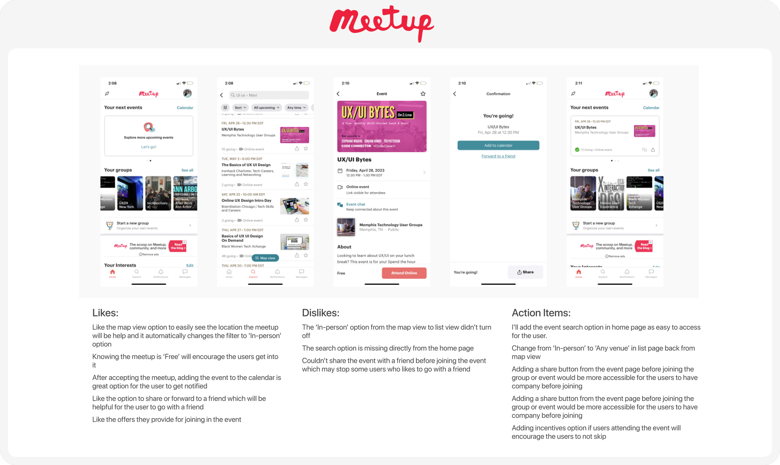
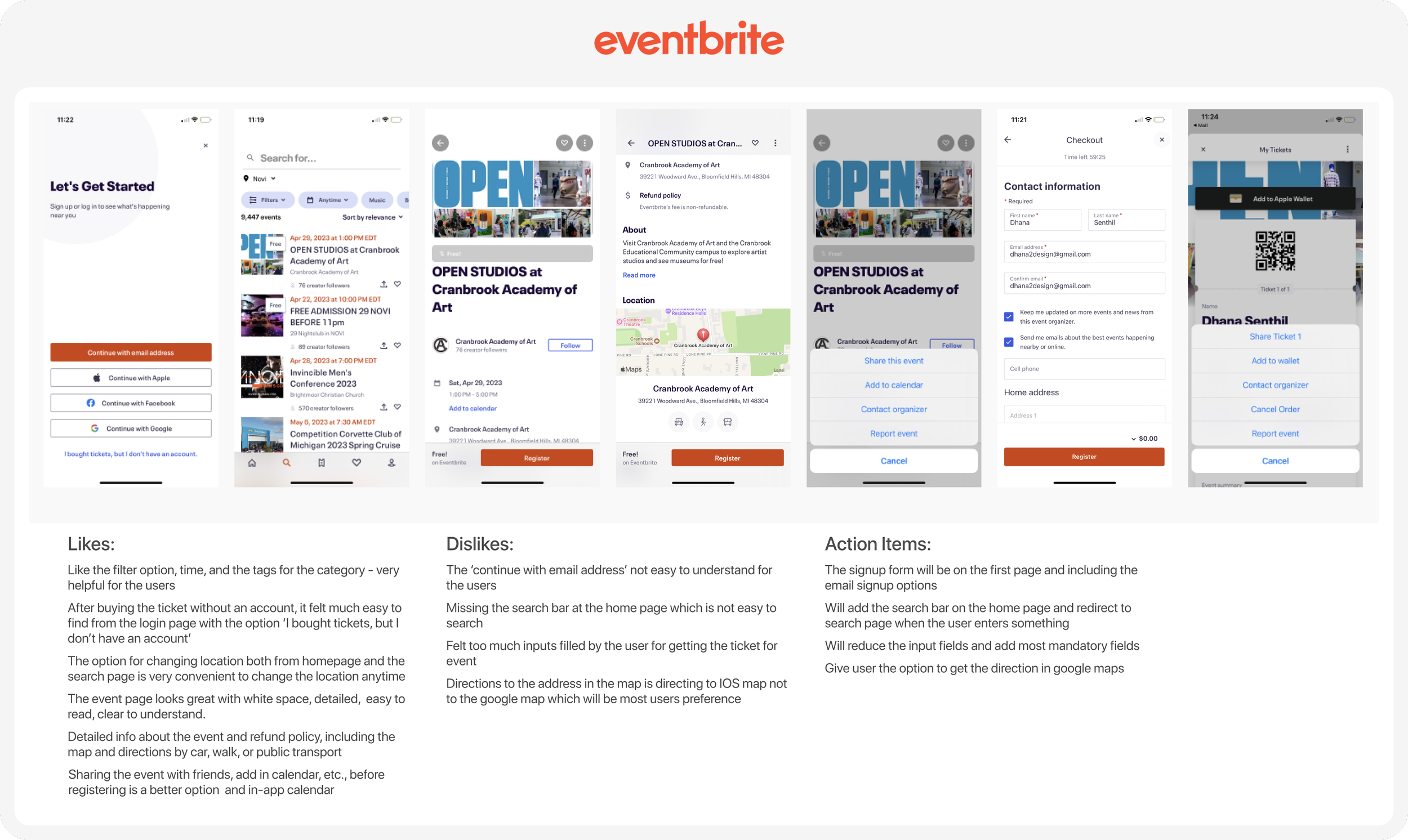
Secondary & Competitive Research
In my secondary research, I attempted to gain an understanding of:
What makes people attend events and activities?
What causes them not to participate in the event?
What will encourage users to attend the event?
And Gathered Points:
Users who book an event by themselves may experience anxiety, potentially leading to their decision not to attend the event.
Users would be interested in finding people with similar interests at the event.
Users consider the incentives associated with the free events.
Users needed to be reminded a few days in advance to mentally prepare themselves for the event.
Users would like to share the event with their friends before they decide to go to the event.
Users who pay for an event are more likely to attend it.
Over 47% of respondents said that if they were to attend an event, they would bring someone else along with them
Affinity map
I categorized the key insights gathered from my secondary research into five main categories: Pain Points, Selecting the Right Event, Easing Anxiety, Generating Interest, and Providing Reminders.
In order to stay on track, it is always important to receive reminders about our upcoming plans and commitments.
Meet the user
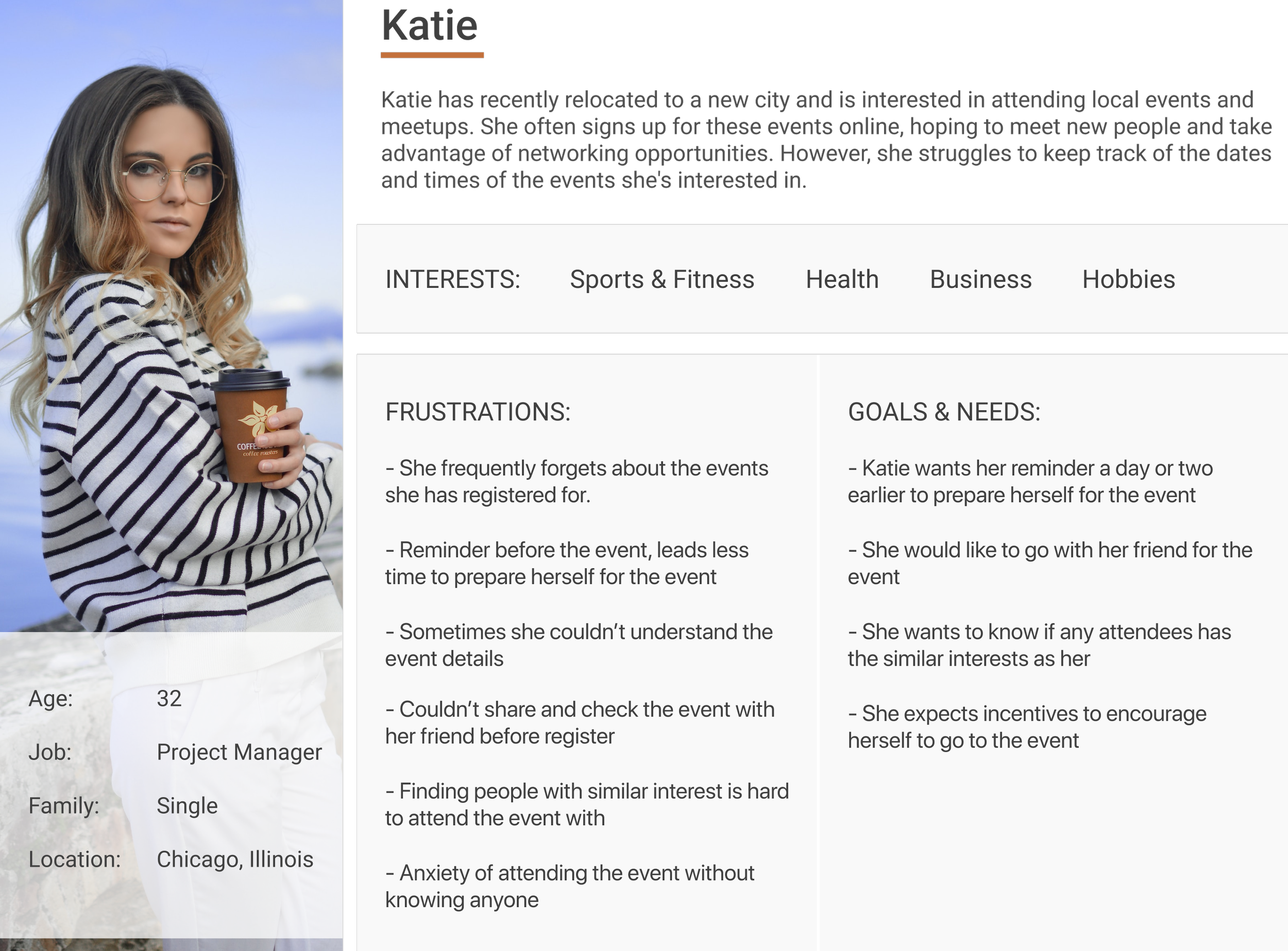
A fitness enthusiast like Katie, always struggling to find the right event with right people
Challenges to opportunities
The following "How might we" questions have been formulated based on Katie's frustrations, goals, and needs:
Help Katie to remember the event ahead of time?
Assist Katie to go to the event with a person?
Encourage Katie to go to an event?
Help Katie to find like-minded people?
Design
Brainstorm solution
To help Katie:
User flows
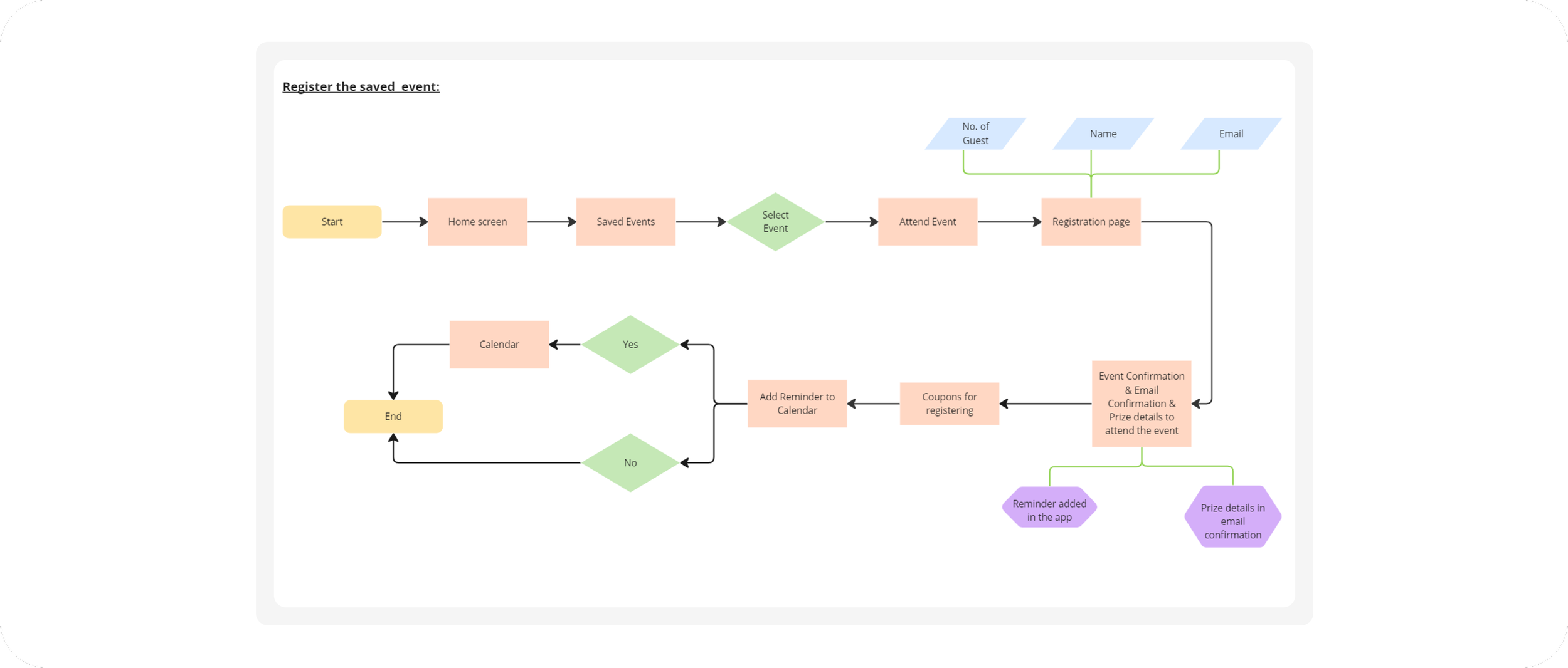
I have developed three distinct red routes and corresponding user flows that we aim for the users to follow:
Find and Share an Event with a friend
Register the shared event
Upload event picture for incentives
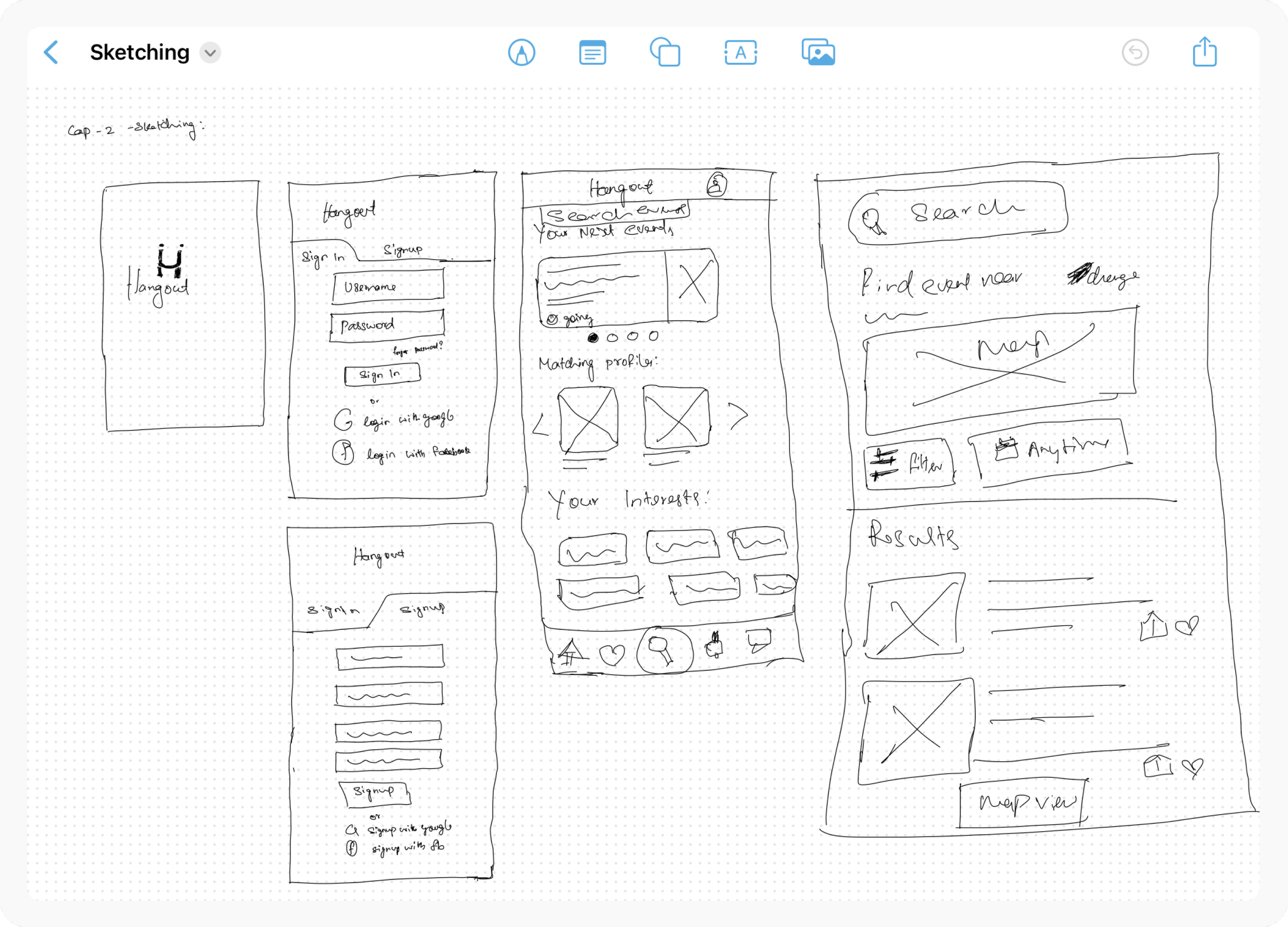
Sketching
I started roughly sketching a few screens to see how to put together my ideas using Freeform app from IOS.
Wireframe
Using a few sketches as a starting point, I have begun constructing the wireframe containing all the screens to ensure clarity of features for the users. This will allow us to test the low-fidelity screens with the participants.
Style Guide
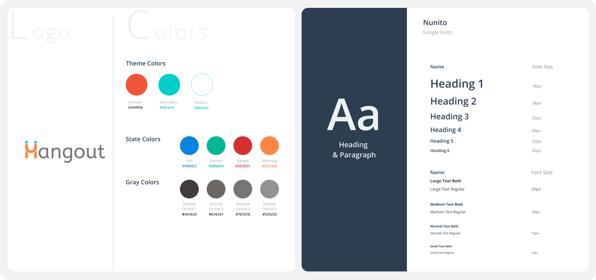
Based on the insights provided by the product brief regarding the brand personality and attributes, I embarked on the branding process and crafted the following brand identity for the product:
High Fidelity Mockups
Incorporating the insights from the guerrilla usability test conducted with wireframes, I made the necessary adjustments and proceeded to design the high-fidelity screens.
Validate
Before:
Issue 3: The usage of the term 'Interested' in both the bottom navigation bar and other modal boxes leads to confusion for the user.
Test & Iterate
To conduct thorough testing, I carried out 5 remote moderated usability tests using the high-fidelity prototype of the product. The participants, consisting of friends and family who have booked and attended events previously, provided the following insights:
Before:
After:
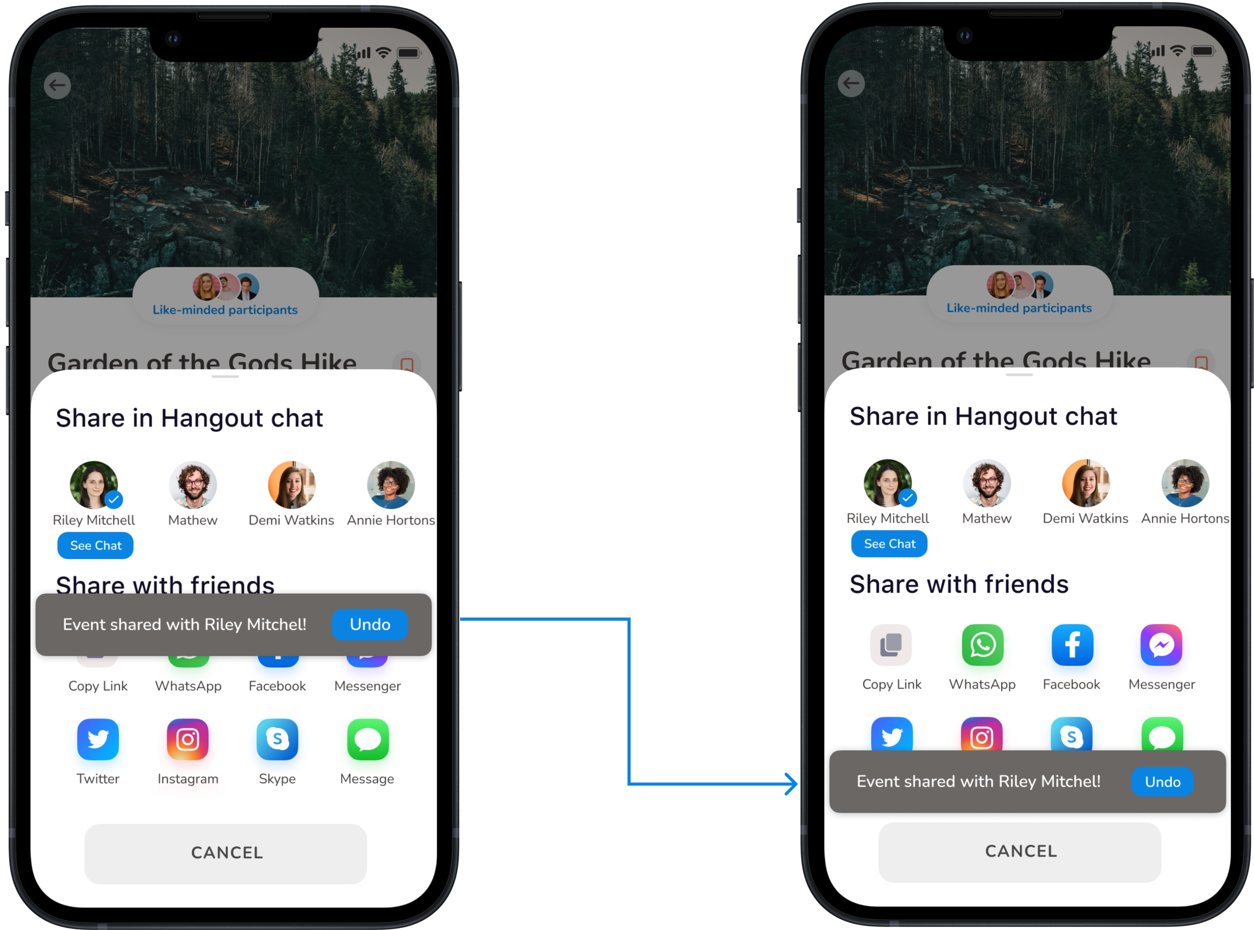
Issue 1: Every participant tried to click on the ‘undo’ without reading it as its too prominent
Before:
Solution: Moved the info box bottom of the screen and auto-hide after a time delay
After:
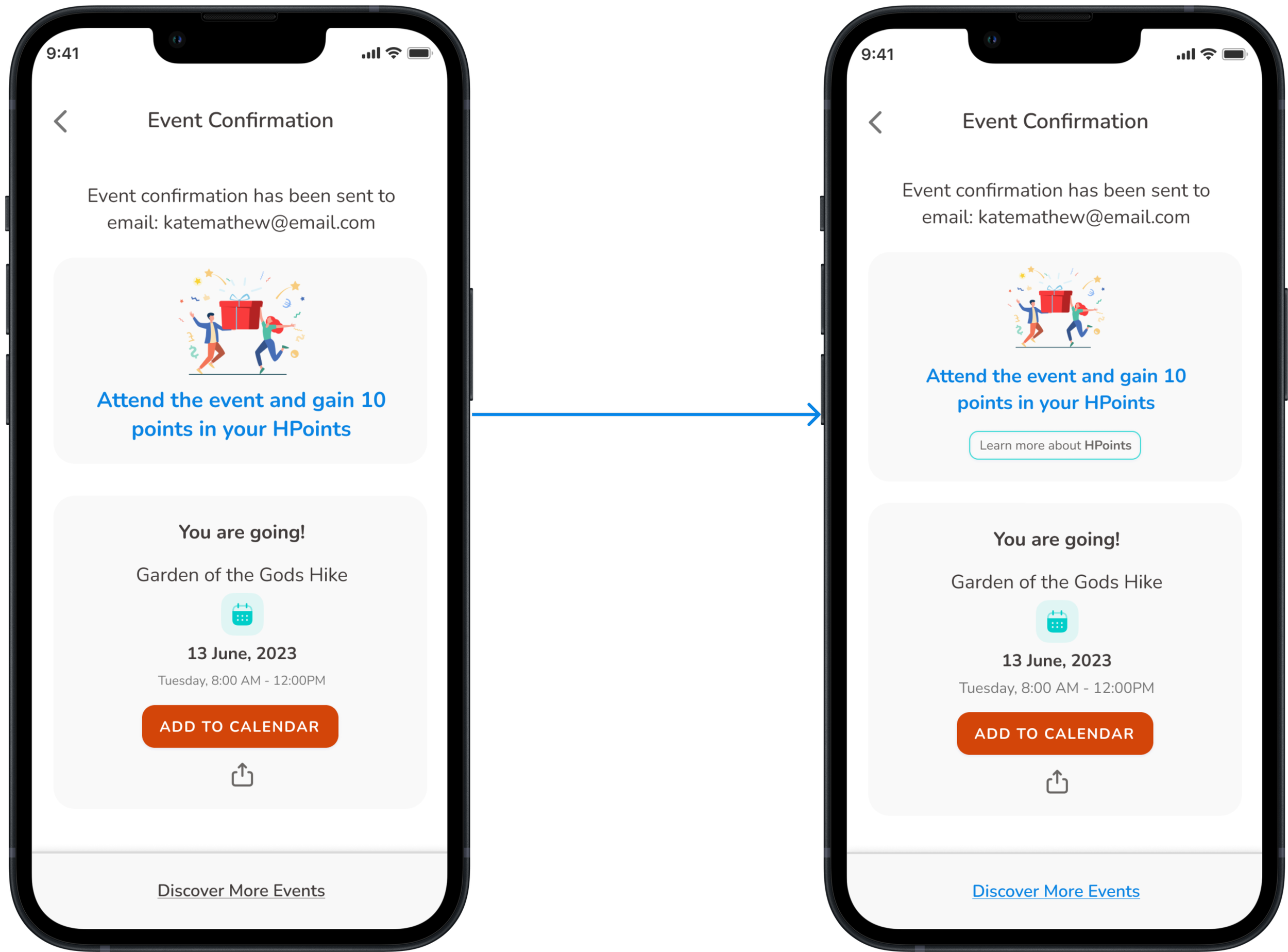
Issue 2: The participants were confused about the meaning of 'HPoints' and its benefits to them.
Solution: Given the link for the participants to learn more about ‘HPoints’ and what are the benefits
After:
Solution: To enhance clarity, the term 'Interested' has been replaced with 'Favorites' in both the bottom navigation bar and other modal boxes.

Conclusion
I firmly believe that usability tests allow us to gain multiple perspectives, not only on usability issues but also on how our solutions benefit the user.
I was pleasantly surprised to discover that the majority of participants felt comfortable attending events with like-minded individuals.
Next Steps
To enhance the app even further, my plan is to finalize all the remaining screens and incorporate an alert option for saved events. Additionally, I intend to conduct a second round of usability testing to identify any additional issues and work towards improving the overall app experience.

