Helps people decorate their new homes and apartments with home-decor

Role
Solo UX/UI Designer & Researcher
Tools
Figma, Pen, Paper, Zoom
Timeline
5 Days
Overview
House2Home is an e-commerce website that sells home décor items & accessories and wants to help people decorate their new homes and apartments.
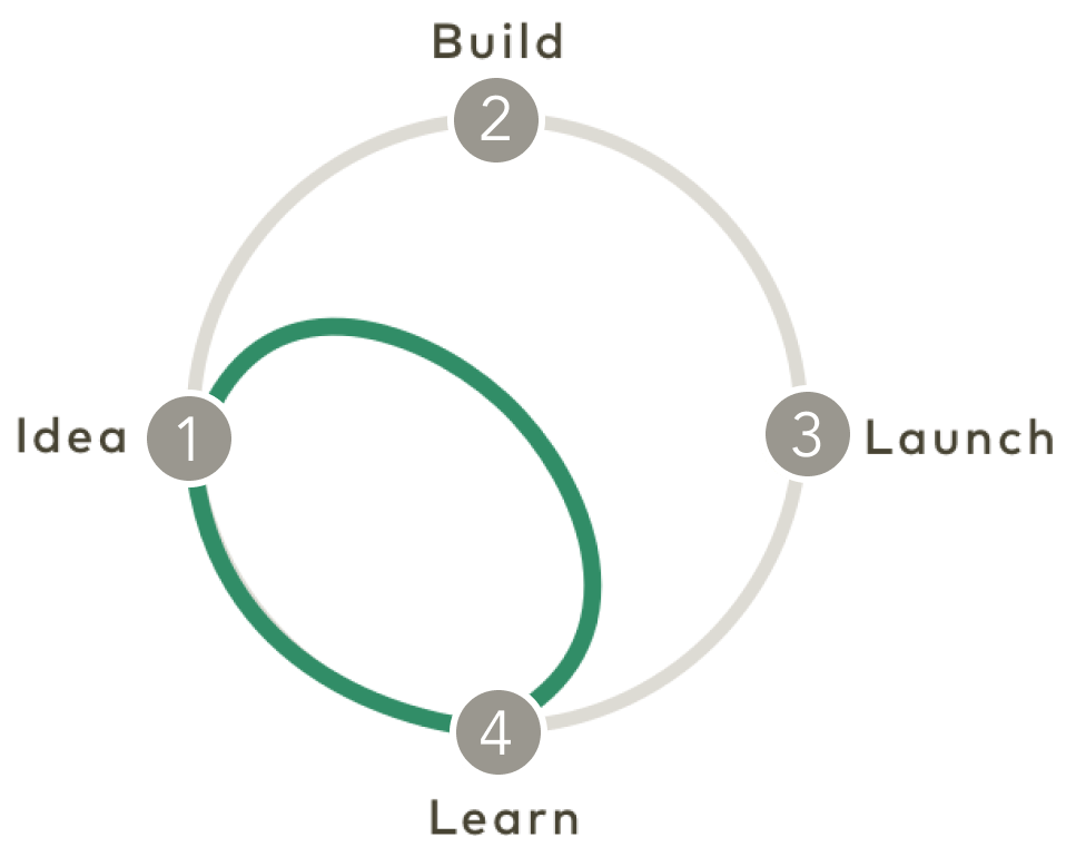
Using a modified Google Ventures Design Sprint method, I worked as the sole designer to research, prototype, and rapidly test a solution within a timeframe of 5 days.
Problem
Through customer surveys and interviews, House2Home has found that many of their customers have just moved into a new home or apartment and want to buy multiple items to personalize their new place - but, they don’t feel confident doing it on their own.
They are able to see things online and are aware of the look they desire. However, they become overwhelmed by the multiple items and give up because they have no idea whether they will work in their home.
Solution
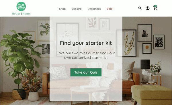
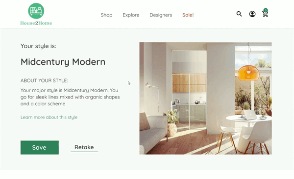
Through an interactive style quiz, the "Starter Kits" offer a well-designed selection of decor items that are tailored according to the individual's taste. The use of such kits will simplify and enhance the process of decorating one's residence.
Process
Executed the Google Ventures modified sprint process: mapping, lightning demos, storyboarding, high-fidelity mockups, prototyping, and usability testing over the course of five days.

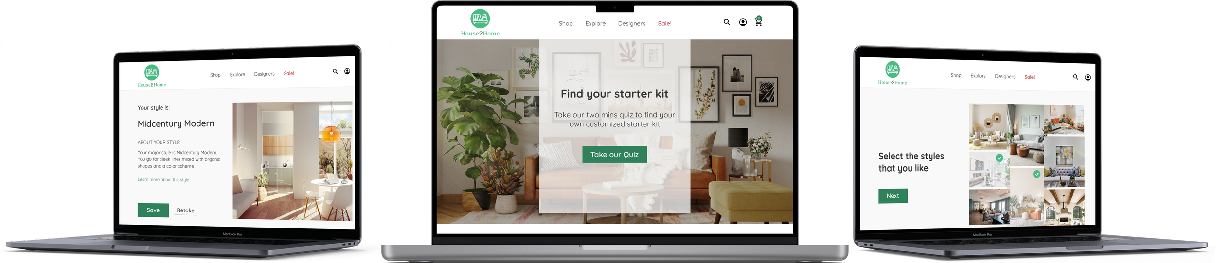
Final designs
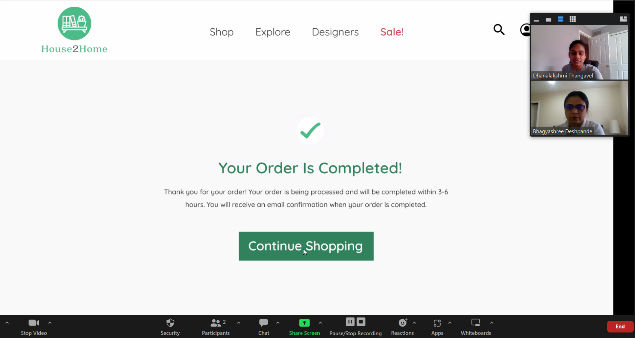
Opting for the product kit recommended in the list and completing the purchase.
Engaging in the design quiz to determine your favored style.
How did I get to the final design?
Day 1 - Understand / Map
Design Constraints
Needs to be a website, optimized for laptop and desktop screens
Focus on the users who want multiple products in a “Starter Kit” to decorate a new apartment/house
House2Home focuses on decorative products and accessories. They don’t sell furniture, appliances or other large pieces.
Most House2Home products are $10 - $50
Research Highlights
I find lots of cool little items that I like, but I never know if they’ll all look good together in the same room until I buy them. Usually, I get overwhelmed and end up not buying anything.
- DanI know the ‘look’ I want, and how I want to feel I walk in... I just don’t know what products to buy to pull it off
- DeenaI want my place to look good, but I never enjoy searching for decorations or items. I’m not super picky about specific items, so spending time searching for stuff just gets tiring.
- RonSo many items look great in the staged photos - but will they look good in my living room? You don’t really know until you order them and see how they look in the space.
- AnnaI don’t have a huge budget for strictly decorative items, so I want the stuff I buy to make the most impact in giving my apartment the look and feel I want.
- Silvia
Meet the user
Ally struggles to find affordable decorative items that match her desired apartment aesthetic and as seen in inspirational photos

Map
Here are the key insights I gathered after reviewing the existing research highlights, Ally's pain points, and her goals:
Budget is a main concern for most users
Finding little things and unsure about how they all fit together
It looks good in the staged picture, but they're not sure how it will look in the user's space.
Know the look they want but are unable to choose the right product
After finding these insights I quickly drew out a few possible end-to-end user experiences for the persona ‘Ally’:

Day 2 - Sketching
Lightning Demos:
Through lightning demos I got inspired by solutions and experiences that other companies have pursued. I looked inside and outside of the online home decor industry to discover best practices and standards.
Amazon:
The Shop by Style & the product recommendation based on customer choices is good.
The Showroom concept with mix & matching as well as designing the room by the customer’s home is a great functionality.

Ikea:
A specific room with products and being able to buy from there is a good option.
As seen on Instagram & Design inspiration are provide a better view for the customers beforehand

Pottery Born:
Room Inspiration and Real-life style which allows the customers to post their house-decorated pictures and share them with other users
The customers are able to buy from that particular room idea.
Customer chat and booking an appointment with a design expert are excellent options for the users

Crazy 8’s Sketching:
After completing the lightning demo, I worked on sketching different possible solutions using Crazy 8's method.

Solution Sketch:
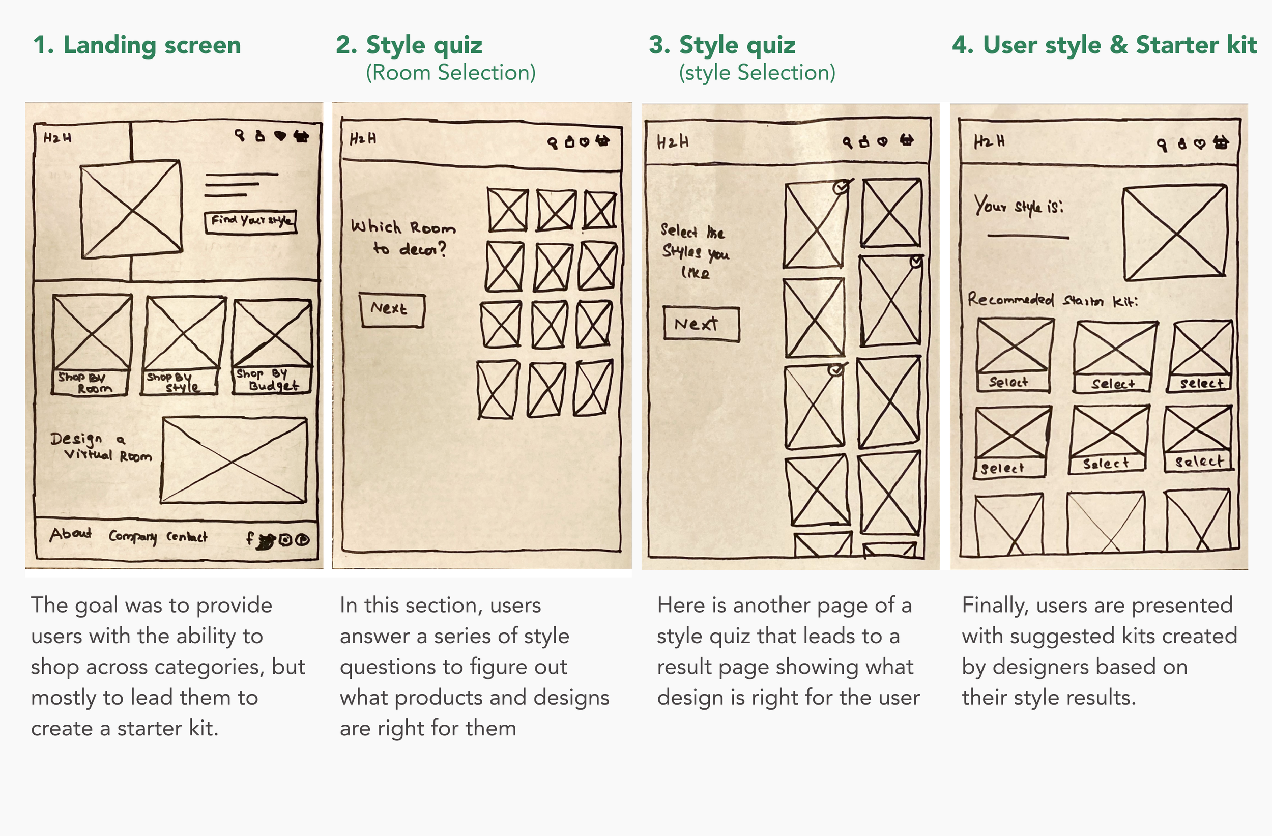
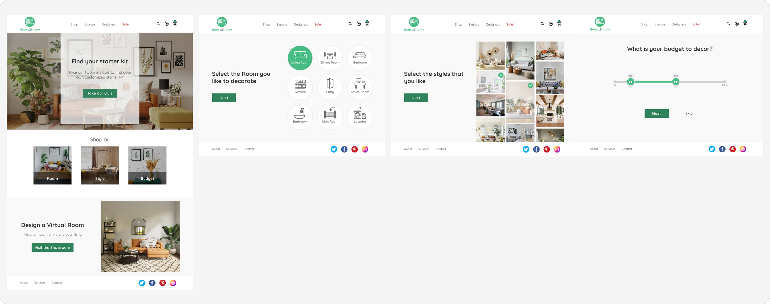
I sketched a four-screen storyboard for the users and how they work through to find their style and recommendation starter kit with the ‘Find your style’ option.
Day 3 - Decide
Decision:
My choice of the above solution sketch is based on the fact that it is helpful to the user in finding both style-based as well as budget-based solutions. It also has the option of "Designing a virtual room" for an enhanced view of the product.
Storyboard:
Created the storyboard with 12 screens to cover the full experience of the flow for ‘Find your Style’ before working on the prototype

Day 4 - Prototype
On the fourth day of the sprint, My ideas and sketches were now ready to be implemented. This high-fidelity screen prototyping and creation process is always exciting because you get to see the sketches come to life
I created 11 high-fidelity screens using the Figma tool based on Day-3 sketches and built an interactive prototype for the screens.


High Fidelity Mockups
Few screens from the prototype:


Day 5 - Testing
In order to validate my design decisions, I conducted 5 potential users for a usability test. I recruited friends and family members participants who are newly moved into a house or looking and interested in home decor.
I asked the users to do simple tasks:
Finding their own style in decor items
Making orders of any decor kit including customization
Usability Test Results
Since the prototype was intuitive and easy to understand, the test was quick with minimal issues. Most of the feedback was similar from each participant. In the overall process, each user was able to get through the flow with no issues. I did identify a number of small design issues and a few functional improvements in iterations:
Just like the user is able to remove the items from the kit, they may also need the option to add new items to the kit
Knowing approximately when the product will be delivered before adding the items
Users wanted to keep the items for later order when there is a sale for that product
The user felt that they want the items as per their room size
The user is confused with the ‘Continue’ button under the payment form page.
Conclusion
The overall experience was fun to design something that I could test and validate within a week with users. Having a limited amount of time pushed me to make quick decisions and come up with creative solutions.
Next Steps
To improve this website further, I would tweak the design based on user feedback and test again until I was confident they had been resolved. In addition, I would like to expand the design functionality to allow users to design virtual rooms.